In this trilogy of Blog posts, we are discussing how you can collect, report, and analyse your print data from multiple sources. Part One covered data collection and how to avoid black holes in your print data. In this second instalment, we will discuss report production, scheduling, and delivery for tasks such as billback, cost allocation, and basic management summary reports.
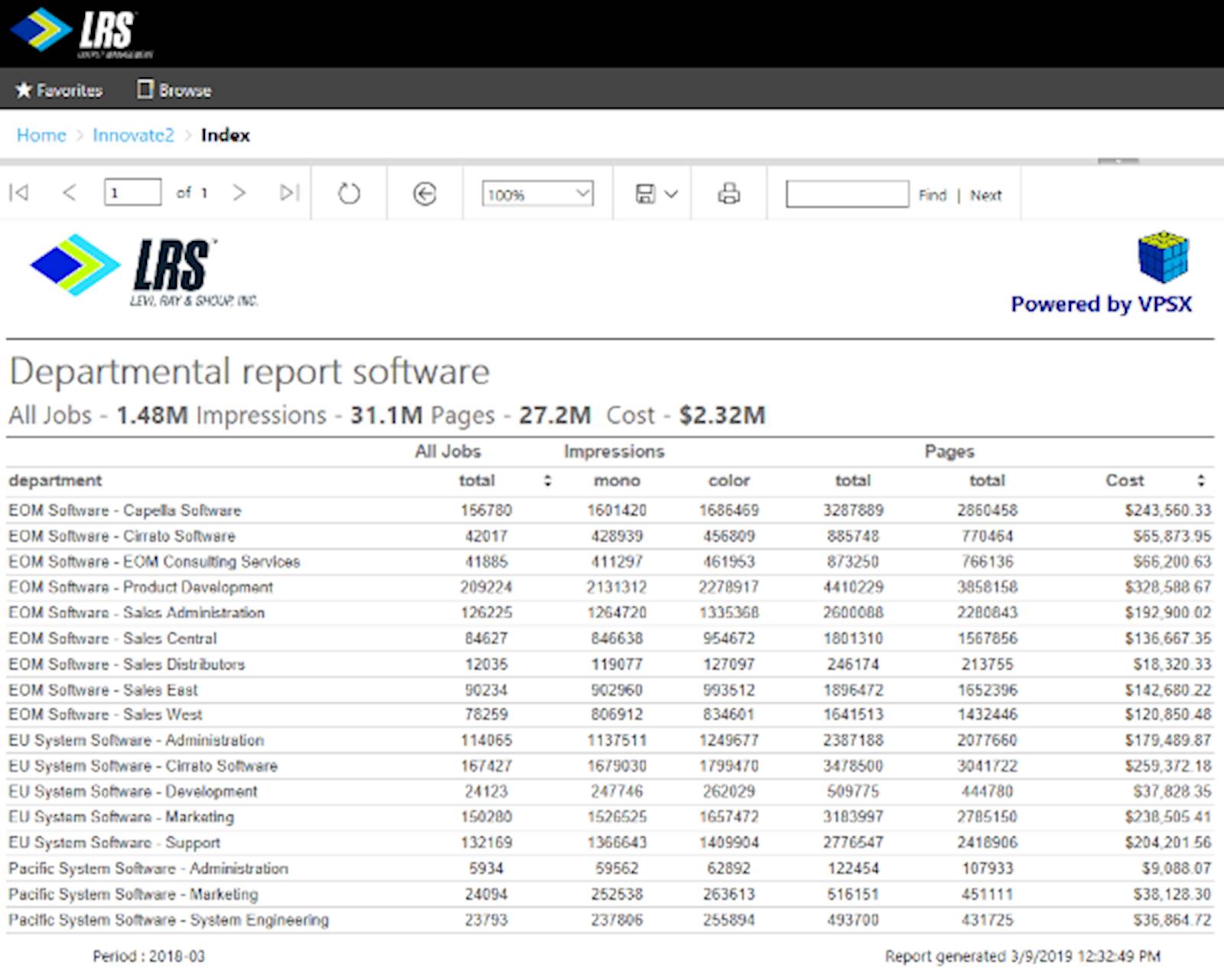
 Traditionally, print accounting software was primarily concerned with tabular reports. As the name suggests, tabular reports present data in rows and columns and are ideal for normal periodic transactional reporting tasks such as monthly departmental cost reports for billback. These reports often cover printing by user, printer, location and grouping by a department or cost centre.
Another common type of report is the “TOP N” report for things like users, devices, colour users etc. These are very often presented using graphics such as pie or bar charts. These are very useful and attractive, a fact that has started a ‘race’ amongst some print management vendors to produce the largest set of reports. Some packages offer over 100 standard reports. At first glance, this sounds impressive, but many of these reports are simply top 10 reports presented multiple times as a pie chart, bar chart and a line chart.
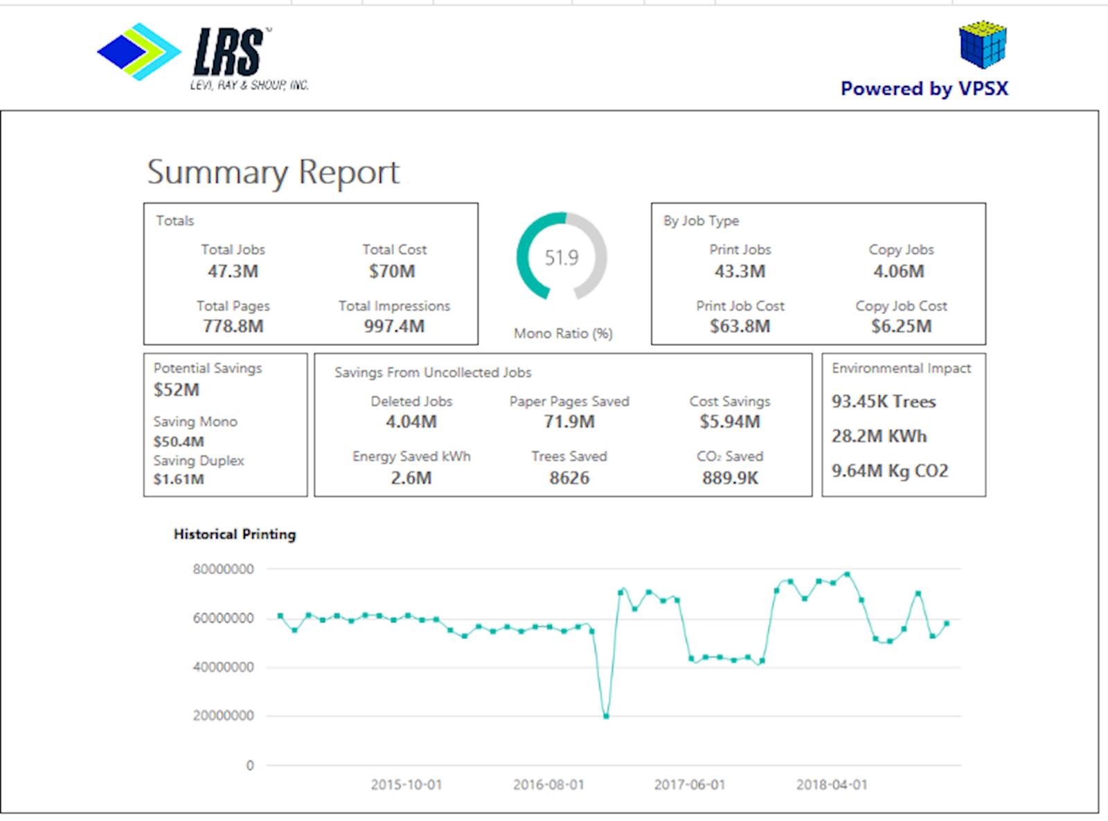
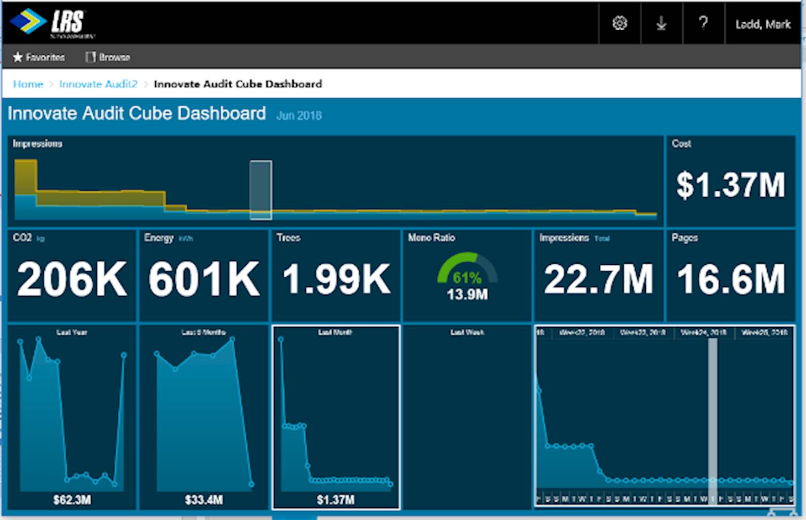
 After tabular and TOP N formats, the final category of reports is the dashboard and summary style of reports. These provide a high-level snapshot of printing activity within the organisation for a certain time period.
 Obviously, being able to see and use your data is the primary goal, but there are a few other important considerations regarding reporting when selecting a print or output management solution.
How will you distribute the reports, and what format will be most useful for your stakeholders? The solution should allow you to flexibly schedule the generation and distribution of the reports. Another consideration is to be able to tailor the format of the report for different type of users. For users who do not wish to carry out any additional formatting, PDF, PowerPoint, TIFF, or MHTML formats may be a good choice. Microsoft Word format could assist a user who needs to customize and publish data for a newsletter, whereas Excel, CSV, or XML would ideally suit a user who needs to manipulate the data or feed this into another automated process.
Sometimes business stakeholders may request a report for which you can’t find a suitable format in the list of standard reports. In this case, how can you create a new one or change that report label, which for some reason causes the recipient to turn a funny shade of vermilion every time the report hits their Inbox?
 The answer is to make sure your reporting system has the flexibility to create and modify report definitions using freely available tools. This will give you the option to remain independent of outside professional services.
So, now we have our print data nicely formatted and ready to be distributed to end users. Great. But you may still get that cold feeling in the pit of your stomach when you hear the word ‘GDRP’ or any one of the myriad other data protection regulations! Whilst no software application can truly claim GDPR ‘compliance’, they can be designed to make the life of data controllers easier. Your reporting platform should allow for granular access to the reports and underlying data. Ideally, this should allow only access to individual reports in line with in your organisation’s data protection policy and should be secured using Active Directory.
In Part Three, we will be looking at how data analytics can help to visualise data and provide further insight.